
DeepDojo.AIPublished 2026-11-07Updated 2026-11-10中文
Write a One-Page Brief Before You Prompt AI Art
"Make me a coffee shop poster with a premium feel." It sounds like a direction, and you could start picking colors and lighting right away. But picture where the image ends up.
A cover on a phone and a poster hanging in the shop aren't the same picture, are they?
Sort out the request before you generate. Who will see it, what is the point, where does the title go, and which details must be accurate? Write the answers down as a visual task description, called a Visual Brief, or Brief for short.
You'll use it again when you pick and revise images, so the preparation pays off.
A visual task description holds eight things: purpose, placement, audience, core message, fixed items, output limits, and so on. Once it's clear, pick out only the part this round needs and turn it into a prompt, and a lot of information stays manageable.
The same subject with a different purpose gives two completely different Briefs and two different images. After writing, check once more and honestly mark any gap as "to be confirmed," so the model has nothing to guess.
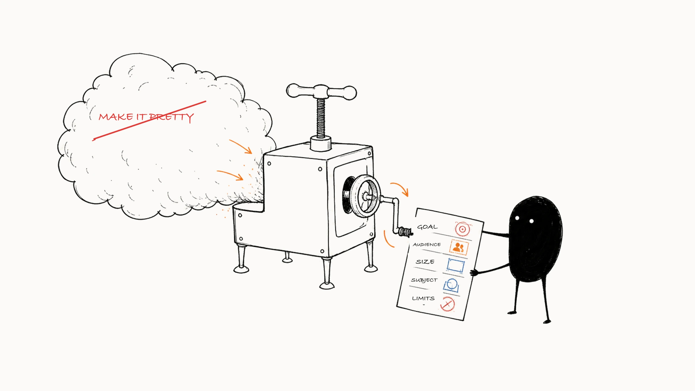
01 The purpose shapes the picture
Say the topic is always "a new neighborhood coffee shop." The image could serve four different purposes:
- A social media cover has to attract clicks in a phone feed, so the subject must be clear and the title area prominent.
- A header image for an article suits a horizontal ratio, and the picture has to work together with the article title.
- A printed poster inside the shop has to account for reading from a distance, print size, and brand information.
- A delivery platform's product image must feature the drink itself, with accurate color and volume.
All four are about a coffee shop, yet people view them differently. On a phone, the topic has to register fast. A poster in the shop is read from some distance. A product image must show the true color and volume. Composition, ratio, and how much information to include all follow the purpose.
If you write only "coffee shop poster," those choices fall to the model. Put them in the Brief and you can judge images as you select: is the subject clear enough, does the title fit, and do the format, information, and publishing conditions work?
02 A Brief has eight parts
Use the eight items below as a checklist, and write only what affects generation, post-production, or acceptance. If one page covers it, write one page. A Brief that runs too long gets hard to consult. Its job is to tell everyone involved what to judge by.
| Item | What to write and why it matters |
|---|---|
| Purpose | The task the image must accomplish, such as letting phone users recognize the opening at a glance. It sets the success standard |
| Where it will be used | The platform and placement, which affect ratio, resolution, viewing distance, and text area |
| Target audience | Who mainly sees it, which guides color, information density, people, and visual tone |
| Core message | What must be understood at first glance, with the rest ranked by importance |
| Subject and scene | The visual center, plus action, time, place, and necessary props |
| Visual direction | Mood described through observable traits such as color, light, and material, to cut down on vague words |
| Fixed and flexible elements | Protect products, identities, and brands. Settings and decoration can be explored. This guides your choice of references and editing method |
| Output and limits | Ratio and size, a text-free version, format, quantity, deadline, forbidden content, and permission, platform, and review requirements |
Adobe’s advice on creative briefs likewise brings together the project background, objectives, audience, and deliverable specifications so the team can agree on the requirements before production.
03 From "premium feel" to a Brief you can act on
Start with the raw request:
Make a coffee shop opening poster with a premium feel.
Fill in the purpose, audience, focus, and protected areas for this request, and the Visual Brief can read:
| Field | Content |
|---|---|
| Purpose | Promote the weekend opening of a neighborhood coffee shop and draw young office workers nearby |
| Where it will be used | A vertical social media cover, with an A3 in-store poster to follow |
| Audience | Nearby users aged 20 to 35 who like quiet spaces and pour-over coffee |
| Core message | First level "new shop opening," second level "weekend events in store" |
| Subject and scene | A pour-over coffee and a wooden counter, the shop in the early morning, people in the frame but not stealing attention |
| Visual direction | Warm brown, cream white, natural side light, restrained lifestyle photography, plenty of blank space |
| Fixed | The brand's cup photo, brand brown, the lower-right logo and the space around it (safe zone) |
| Flexible | Background plants, small items on the table, light and shadow details |
| Output and limits | 3:4 vertical, text-free base image first. No generated text, logo, or invented prices |
Now "premium feel" has something to stand on: warm brown, cream white, natural side light, and blank space. The cup is already marked fixed, so production has to protect it with a real photo. Text, price, and logo are left to post-production. Choosing images follows the same order: satisfy the cup and title space first, then compare which has the better mood.
Words like "premium," "healing," "techy," and "cinematic" can stay, since they express what you care about. But for someone else to understand them, and for a model to generate from them, they have to be more specific. Once color, light, material, and blank space are spelled out, others can see the direction you have in mind. Also resolve words that conflict. "Minimalist" and "rich, intricate detail" need a decision on which one leads, and so do "harsh noon sun" and "soft, shadowless light."
04 Sort your input material first
When you write "keep the brand cup," check whether you have the photo. The requirement may be clear while the material isn't there yet, and how far you can go depends on how much material has arrived. Common material falls into four groups:
- Material that must stay faithful: real product photos, authorized portraits, official logos, brand fonts.
- Visual references: examples of layout, color, material, lighting, and style.
- Content: titles, selling points, dates, addresses, prices, and calls to action.
- Output specs: sizes, file formats, platform limits, and print requirements.
When you organize, mark each item "provided," "pending," or "to be made." If the cup photo hasn't arrived, you can still try backgrounds and layouts, but whether the cup is faithful has to wait for the official material. If you already have the logo, still place it in post-production so its shape and text stay accurate.
Give each reference image a purpose too. A photo of a coffee shop might serve for the space or for the warm light. Write "use only the left-side blank space and the early-morning side light," and both the model and your collaborators can tell which traits to use, so fewer pieces of the original furniture, people, or brands slip in.
05 Brief, prompt, and acceptance criteria each answer one question
Each of the three answers its own question:
Brief: what task must this image accomplish?
  ↓ pull out what the current image needs
Prompt: what should the model draw this round?
  ↓ generate candidates
Acceptance criteria: how do we tell the image is usable?
A Brief holds the purpose and audience as well as fixed content and delivery requirements. When you're ready to generate, pull out this round's subject, action, scene, composition, light, color, and style and write them as a prompt (see how to write AI image prompts). When the images arrive, check them against concrete criteria. Continuing with the coffee shop, the first-round prompt can focus on a text-free base image:
Vertical lifestyle photograph, a white branded coffee cup on the lower right of a warm wooden counter, early-morning natural side light, a quiet neighborhood coffee shop in the background, warm brown and cream white palette, large clean blank space in the upper left, restrained, realistic, low information density, no text.
This text sets the direction. To really keep the cup, you also need to attach the cup photo, limit the edit area, or keep the cup on its own layer and generate only the surroundings. If the photo hasn't arrived, label this round a "composition draft" and make the real product image once the material is in.
The matching acceptance criteria for round one:
- The cup is the clear subject and can still be recognized when small.
- The upper left has room for a two-line title.
- Light and color fit the brand direction.
- The cup's shape matches the reference image.
- The background has no high-contrast element that competes with the subject.
- The image has no garbled text, fake marks, or obvious structural errors.
When a result misses the mark, find the matching stage before you fix it. If the purpose changed, change the Brief. If the model drew the wrong thing, change the prompt or inputs. If a publishing condition isn't met, fill the gap according to the acceptance criteria. For how a full Brief is used across a project, see a spring product poster in twelve steps.
When extracting the generation instructions, use Firefly’s prompting guidance to turn the scene into a specific subject, descriptive terms, and visual details.
06 Two Briefs for the same topic
Now take "city cycling." If the image is for a lifestyle account, the task may be to get users to read a weekend route post. If it's for a helmet ad, the task is to show the product accurately and convey safety. The topic is the same, and the two Briefs make different choices.
| Field | Weekend cycling content cover | Cycling helmet product ad |
|---|---|---|
| Purpose | Get users to click the route post | Show the helmet and lead people to learn about the product |
| Audience | Beginners who want to start cycling in the city | Consumers who already cycle |
| First-level message | Relaxed, approachable city cycling | The real helmet's look and how it is worn |
| Subject | A rider and the city street | The helmet, with a person demonstrating use |
| Fixed | Title area, city setting traits | Product shape, color, markings, and how it is worn |
| Flexible | Person details, street plants, light and shadow | Background street, lighting, sense of speed |
| Output | 3:4 text-free cover | Horizontal ad and square product image |
| Risk checks | Reasonable road behavior, no wrong text | Real product, accurate markings, no overstating of protection |
In the first image, the person and street have plenty of room to explore, and what matters is that people want to learn about the route. In the helmet ad, viewers judge the product by the picture, so product shape, color, and how it is worn become fixed requirements, and the atmosphere can be left to AI. If you reuse a prompt, recheck the material, the generation scope, and the checks along with it.
07 Arrange the image by information hierarchy
Coffee, the shop, plants, staff, discounts, an address, and a brand story are each useful alone. But the image has to let one thing be seen first. If every item fights for the first glance, nothing ends up clear. Sort the information into three levels:
- Level one: the subject or theme that must be seen first.
- Level two: the action, setting, or activity that helps explain the scene.
- Level three: decoration and details that add mood.
Once priority is set, composition follows. Make the main person or object larger, with clearer contrast and a fixed position. Reserve the title position early. Use background details to support the subject.
08 Check after writing, and mark gaps "to be confirmed"
A Visual Brief that is ready for generation can answer at least these questions:
- What specific task must the image accomplish?
- Who sees it, and where?
- What must be understood at first glance?
- Are the subject, action, and scene clear?
- Are the aspect ratio, size, and title space settled?
- What content must stay accurate?
- What content may the model explore?
- Which files will you deliver?
- Who checks people, products, material, and platform rules?
For items you can't answer yet, mark them "to be confirmed" and say what they affect. An undecided size affects composition, and a missing product image affects shape checks. Writing the gaps down lets your client answer them directly, and shows which work can start now.
If several items are missing, fill in the one that could force a restart of the whole image first. Settle purpose, platform, audience, and core message early. Decoration, small background props, and slight color differences can usually wait. Whichever item is costliest to change, confirm it first.
For a personal project, one page of notes covering purpose, subject, fixed elements, and output is enough. For team work, add dates, versions, and who confirmed it, and save a new version whenever the request changes, noting what changed.