
DeepDojo.AIPublished 2026-11-07Updated 2026-11-10中文
How to Make an AI Poster, From Brief to Delivery
Writing the brief, choosing a tool, generating, and revising are usually learned as separate skills, which helps you see each step clearly. In a real job the steps connect. If one asset is missing, the generation scope changes.
If you swap candidates, the compositing that follows may need adjusting. When something changes, you need to know which step to go back to, and then carry on.
This time we start from a poster for "spring lime cold-brew tea." The client has a real product bottle, brand colors, and a logo. We use AI to find the background and mood, then go to design software to place the real product, text, and brand files, all the way to delivery.
This is a hypothetical project, used to show what each step should leave behind.
Across the twelve steps, the early ones turn the request into a visual task description, decide what goes to generation and what stays in design software, choose the tool route, and prepare assets and references.
The middle covers generating, picking, and adjusting, then compositing the real product into the image and making the landscape version. The end checks quality and risk, delivers, and archives. When the premise of a step changes, go back to that step.
A change in requirements midway usually means going back one or two steps, and a restart from the beginning is rarely needed.
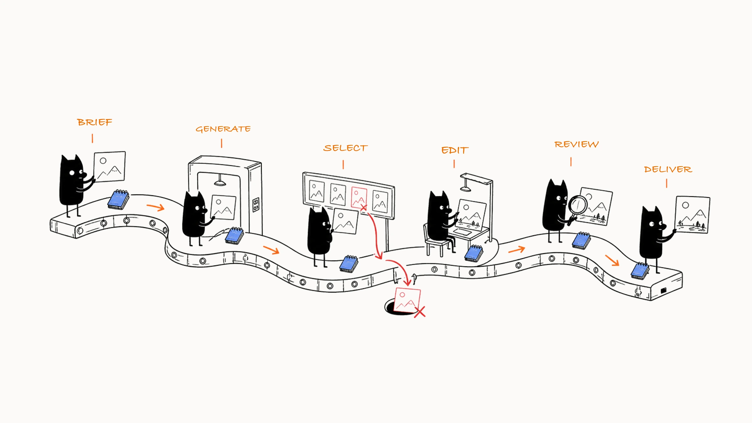
01 A twelve-step workflow
A reusable AI image workflow can be split into twelve steps:
Take the request → write the Brief → decide what to keep and what to generate
  ↓
Choose a tool → gather assets → write the prompt and control conditions
  ↓
Generate candidates → choose → change one thing at a time and converge
  ↓
Local edits and post-production → quality and risk checks → deliver and archive
As you read the flow, notice what each step prepares for the next. Generation has assets and a scope, selection has task criteria, editing starts from the chosen image, and delivery uses confirmed versions. Save the results and the reasons, and when you need to go back, or someone else takes over, you know where to continue.
02 Step one: organize the Visual Brief
The client says: "Make a fresh, youthful poster for our spring new product, to be released next week." Fresh and youthful already say the feeling they want. Then ask more specifically: where will it appear, who will see it, and what do they see first? Which parts of the bottle must stay? What size is needed, and which files are delivered? Once those are answered, you know which image to choose later. After confirmation, the Brief can read (see writing a Visual Brief for how to write each of the eight parts):
| Field | Content |
|---|---|
| Purpose | Launch the spring lime cold-brew tea and get young users interested in the product |
| Platform | 3:4 vertical for social media, plus a 16:9 banner for the website |
| Audience | Users aged 18 to 30 who like fresh, light drinks |
| First-level message | The real product and "fresh spring" |
| Second-level message | Lime, a cold-brew feel, and the launch date |
| Subject | The real bottled cold-brew tea provided by the client |
| Visual direction | Light green and off-white, natural window light, clear glass and water droplets, clean blank space |
| Fixed | Product shape, package color, label, brand colors, logo safe area |
| Flexible | Background surface, lime placement, water droplets, and light and shadow |
| Output | Vertical and horizontal finished images, a text-free base image, editable source files, and process records |
Also write down the hard requirements: product information is accurate, the title and logo are added in post-production, the background has no real shop signs or other brands, and AI content labeling and platform checks are completed at publication.
03 Step two: divide the generation boundary
Sort the elements in the image into three groups:
| Group | Contents in this case |
|---|---|
| Real asset layer | The product bottle, package text, logo, title, launch date, and QR code, taken from the client's official files |
| AI generation layer | Window background, tabletop, limes, water droplets, soft light and shadow, and a few decorations, open to exploration |
| Human check layer | Product accuracy, color, title legibility, trademarks, permissions, platform ratio, and AI labeling |
The bottle and packaging already have official files, so keep them directly and leave the space for exploration to the background and light. The generator finds scene and composition, the canvas and design software place the product, text, and logo, and local generation connects the shadows and edges. With this division, creativity can keep being tried and the product itself has a reliable basis. If the client would rather redraw the whole bottle, first explain that packaging and structure may change, then recommend a real product layer. The setting can still be explored, and checking the product always has the original material as a reference.
04 Step three: choose a route and set three confirmation points
This project has to explore backgrounds, arrange the product position and blank space, and also do precise layout. The generation tool needs to support reference images, the target aspect ratio, and background changes, and you can choose conversational editing or an existing workflow to match how you collaborate. Final layout goes to design software that handles layers, text, and multi-size export. When you choose a tool, look at five things: whether material can be uploaded, whether the current account permits commercial use, whether the product can be protected, whether export sizes are sufficient, and whether the team can keep editing. Tools get updated, and those requirements still work as a basis for judging.
After the tool is set, think about what the client has to confirm at each step. Confirm at three points and save the passed versions and comments:
| Point | When and the pass criteria |
|---|---|
| Direction | After the first round of candidates, confirm purpose, composition, light and color, and mood, and set aside water droplets and texture detail for now |
| Structure | Before product compositing, confirm product position, title space, the vertical and horizontal relationship, and main props, and after passing, focus on local edits |
| Final | Before export, confirm the real product, text, logo, technical specs, and risk checks |
Set separate time or quota for finding direction, converging, and local editing. If a stage hasn't passed when its budget runs out, pause and check whether the request is clear, the material complete, the tool suitable, and whether the candidates are worth continuing. Save files by stage, and keep real assets apart from temporary generated images.
05 Step four: prepare assets and references
The client provides front and 45-degree product photos, the logo, brand color values, and packaging guidelines. First confirm that the files are clear, the permissions cover this project, and the product version matches what goes on sale. Then prepare three kinds of references:
- Layout sketch: product at lower left, with space left at the top and right for information.
- Color board: light green and off-white as the main colors, with a little lime yellow as an accent.
- Light and material: diffuse window light, transparent water droplets, and light stone.
These references each provide position, color proportion, light, or material information, and you note the source and license for each. Images with strong brand features and specific artworks stay out of the style board.
How much room the text needs is easy to remember only after the image arrives. Right now, use simple boxes at about the right sizes for the title, selling points, logo, and QR code, and put them into 3:4 and 16:9 canvases. When candidates come in, you can try placing them right away, with less need to redo composition because the text doesn't fit. Sort the asset status:
| Status | Contents in this case | How to use it next |
|---|---|---|
| Official | Product, logo, fonts, and copy | Used in the final, checked against the original files |
| Generation reference | Layout sketch, color board, and light reference | Each guides generation by its purpose |
| Awaiting client confirmation | The missing date or QR code | You can find the visual direction first, then deliver once everything is complete |
Mark temporary placeholder material clearly, replace it item by item as the official product, logo, and copy arrive, and confirm during the final check that all placeholders are gone.
You can upload the layout sketch using Firefly’s composition reference method, letting its outline and depth guide product placement and spatial relationships.
06 Step five: prepare generation conditions, then explore and choose a direction
With assets and layout ready, round one's scope is clear: look at background, composition, and light and color first. You can place a brand-free placeholder bottle or generate only the background, and the official product comes in later.
3:4 vertical spring drink ad background, a light beige stone countertop near a bright window, space reserved at lower left for a single bottled drink, with only two lime slices and a few water droplets beside it. Soft early-morning natural light, a low-saturation light green and off-white palette, a fresh, light, youthful lifestyle commercial photograph. The top and right stay clean and low in detail for the title and logo later. No text, no brand, no extra product.
Generate four to six images at the 3:4 target ratio and moderate quality, letting composition and props vary a bit. After you settle on a direction, fix the chosen image, lower randomness, and strengthen the layout reference. For the final, raise the size and quality of the selected image. Before round one, write what acceptance will look at: whether the product position is clear, whether the title area is large enough, whether the limes steal the focus, whether the light and color fit the brand, and whether the background can composite with the real product.
Put the six candidates on one comparison board and overlay the title, logo, and product placeholder boxes. Pass the hard requirements first: correct ratio, the product area intact, enough room for text, and no real brands or wrong text in the image. Compare what remains on purpose, composition, light and color, and cost of editing. B has the most attractive light, but it has too many props. D is slightly cool, and its composition and blank space already work. We choose D for this project: adjusting the color is less work than reorganizing a pile of props, and it's closer to the delivery requirements. The selection record reads:
Chosen: D
Keep: product position, top blank space, window light direction, light stone
Problems: overall too cool, the lime on the right has too much contrast
Next round: adjust the color temperature first, then lower the lime's presence separately once confirmed
Why the others were dropped: A title area short; B too many props; C product area too small; E garbled text; F composition weighted to the right
Handle the two problems separately, and each time you can compare the effect of the matching change.
07 Step six: adjust the image step by step
Handle D's coolness first. In round two, keep the composition, aspect ratio, and light direction, brighten the off-white and light green a little, add a bit of warm morning light, and leave the product area and title area unchanged. Choose D2 from three, then look at the lime on the right. Round three reduces its number and contrast so it falls back to a supporting role. If the composition changes during the color edit, bring D back and strengthen the image reference, or hand the color correction to design software.
Save before-and-after images each round, and look at how much of the problem is fixed and whether anything you liked got worse. When you see a new image you may want to keep editing, but if the comparison shows little improvement and some loss of what was good, go back to the previous version. Once composition and background pass, save this version and move on to layered compositing.
08 Step seven: product compositing and local blending
Place the client's product image on the canvas, adjust proportion and position, and set the bottle base on the stone surface. By the main light direction of the scene, add a soft contact shadow and a little environmental reflection to the product. The AI edit (for the mask and local prompt, see five ways to edit an AI image) circles only the bottle base, shadow, and surrounding tabletop:
Keep the real product bottle, packaging, label, and color. Generate only a natural contact shadow and a slight tabletop reflection at the base of the product, with light entering from the upper-left window and the shadow extending to the right rear. Keep the stone texture and background continuous.
Once the contact shadow looks natural, put the product beside the original: do the outline, cap, label, color, and transparency all hold? If the blend touched the product, go back to the previous version, shrink the mask, or make the shadow directly in design software. The product has to join the new environment and stay accurate. Then place the official title, selling points, launch date, and logo. Text layers use the brand fonts and grid, and the QR code comes from the official file. Lower the title-area background contrast slightly as the layout needs, and set all the text in design software.
In Firefly, Adobe’s Generative Fill steps pair the selection with a text description: choose the area first, then describe what should fill it.
09 Step eight: make the horizontal version
Once the vertical version passes, copy the background and product layers to a 16:9 canvas. The horizontal plan puts the product on the left and leaves the right for the title and call-to-action button. If the original background is not wide enough, first remove the text layers and extend only the window space and light wall to the right:
Extend to a 16:9 horizontal, keeping the left tabletop, window light direction, and light green and off-white palette. Extend a low-detail light wall and soft light to the right, with the right 45% for the web title and button, and no added product, people, text, or high-contrast props.
After extending, rearrange the real product, text, and logo for the horizontal format, then check tabletop perspective, product size, and what a narrow screen would crop. The assets carry over from the vertical version, and the position of information still has to be redone. If you simply crop, the old blank space usually no longer works.
10 Step nine: quality and risk checks
Quality checks run from large to small:
- Task: whether the spring new product, the fresh feeling, and the product subject are clear.
- Layout: whether title area, logo area, and safe margins pass in both vertical and horizontal.
- Image: whether composition, light, color, material, and contact shadow are unified.
- Product: whether outline, packaging, color, label, and volume match the real item.
- Details: whether the lime, water droplets, edges, reflections, and background look natural.
- Technical: whether pixels, format, transparency, compression, and each platform version are right.
Also check risk from input to publication: the client has the right to provide the product, logo, and copy, and the license for reference material is clear; the tool and model permit this commercial use; the brands in the background have been checked and the claims match the real product's effect; and the current platform's AI content declaration and labeling are used at publication. Shrink the image to a phone feed size, drop it into a web hero, and export test images to check color and compression. Once the real-environment preview passes, export in batch.
11 Steps ten and eleven: the delivery package and review
When you hand over files, think about whether the recipient can use them directly: which one is for social posting, which is the web banner, and which can still be edited. Name the files with project, use, ratio, and version so the finished images, text-free base images, source files, and process records are easy to tell apart. The delivery package includes the vertical and horizontal finished images, the text-free base images, editable source files, compressed versions the client asked for, and the process and permission records. In the source files, the product, logo, and text layers are locked, with clear layer names. The delivery note lists the checks done, the steps where AI was used, and the product copy and publishing settings the client needs to confirm again. If the client changes platform, region, copy, or use, recheck the layout, permissions, and labeling.
After the project, note what worked, where rework was heaviest, which assets and methods you can reuse, and what to check more at the start next time. This case leaves behind the background prompt, color board, product compositing steps, the vertical and horizontal grids, and the quality and risk checklists. Next time, for a summer flavor, you can reuse the structure and reconfirm the product, seasonal colors, and props. Also keep failures along with the conditions and conclusions, such as in this project "high reference strength brought in the old background," "too many limes steal focus," and "the horizontal version needs its own blank space."
12 When the request changes midway, where to go back
When the request changes midway, look at the actual impact first, then decide which step to resume from:
| Change | Where to handle it |
|---|---|
| Title changed, original space is enough | Update the layout |
| Longer copy, original blank space isn't enough | Recheck information priority and composition |
| Vertical changed to horizontal | Rearrange the composition |
| Product packaging updated | Swap in the real material and recheck light and shadow |
| Audience or brand direction changes | May need to rewrite the Brief and find a new direction |
For example, if a four-character title becomes a three-line description, first try whether the text fits, then decide whether to adjust the background. When a request changes, note who raised it, the date, which files are affected, and at which step it has to be reconfirmed. That separates a production error from a changed request, and makes the extra work easier to estimate.
When you get stuck halfway, check backward from the most recently confirmed version:
- No usable candidate: check the Brief, tool, and round-one conditions.
- The direction is right but each image changes too much: check references and settings.
- Fixing a local spot ruined the subject: go back to the original, or composite in layers.
- A permission or fact problem: pause publication and reconfirm the material.
When you roll back, state the starting point and the reason, save the version and the decision record, and reconfirm against the standard for the matching point.
Having run the whole project, you can see a few things the course keeps valuing: the task is clearly stated, generation and editing have a basis, choosing images and checking are the person's job, and real assets and post-production design are used in the right places. A beautiful image is worth pursuing, and so is delivering one that can be used for its purpose. After tools update, these judgments still hold.