
DeepDojo.AIPublished 2026-11-07Updated 2026-11-10中文
Why AI Images Get Worse the More You Edit Them
After you generate a few images, the real work is deciding what to do next. One has great action, another has better blank space. Which do you keep? And once you pick, how do you revise without throwing away the parts you liked?
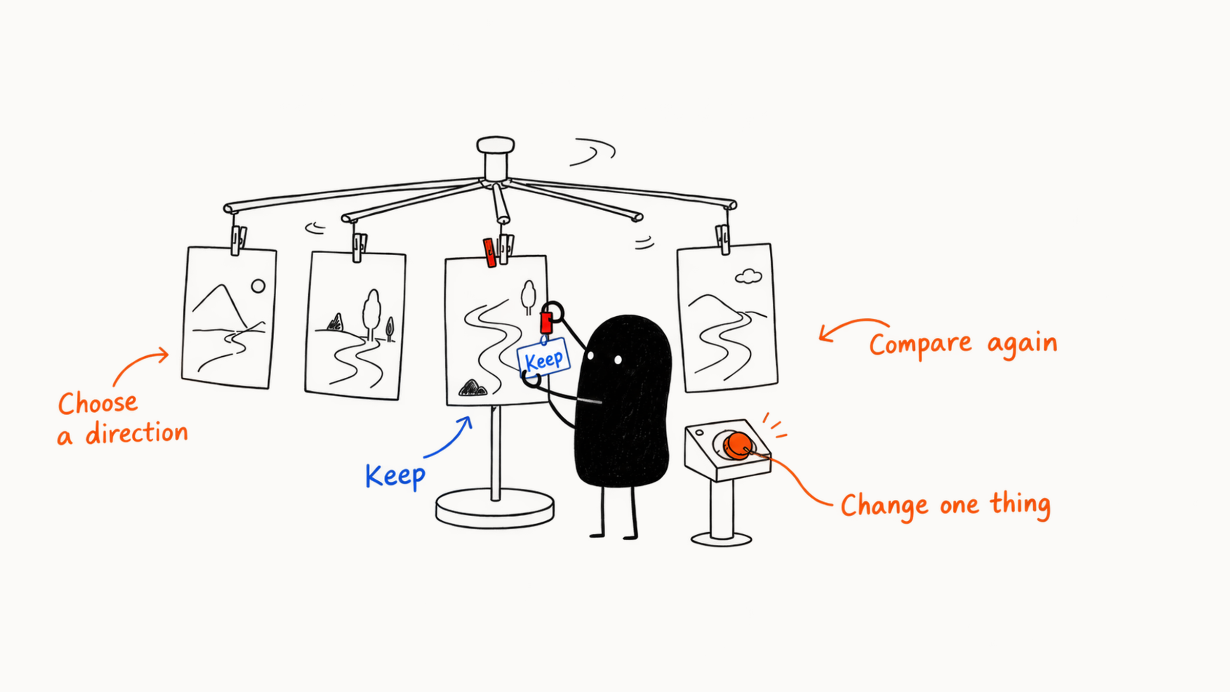
Picking from candidates, editing, and then deciding the next step from the result is called iteration. When you settle on a direction and reduce the variation until the image stabilizes, that's convergence.
Before each round, work out what stays, what changes, and why. Then the next round can pick up where the last one ended.
Image production divides into four stages: exploration, selection, convergence, and finalizing. The first round only judges the broad direction. When selecting, pass the hard requirements first and compare quality second, put the candidates side by side on a comparison board, and pick the one with the right structure that's easy to fix.
Before each revision, note what stays, what the problem is, and what this round changes, and change only one key variable at a time. Decide in advance when to continue, branch, or start over, and when to stop, or the image drifts further with every pass.
01 Four stages of making an image
An image goes from idea to finished piece in four stages: explore, choose, converge, and finalize.
| Stage | What you do | Comparison standard |
|---|---|---|
| Explore | Generate different compositions, scenes, or styles from simple conditions | Variety and difference in direction |
| Choose | Pick one or two directions by purpose and acceptance criteria, and note why | Value of the direction and cost of editing |
| Converge | Fix subject, composition, light, color, and style, and solve one main problem per round | Consistency and control |
| Finalize | Protect confirmed structure, then handle local fixes, layout, size, color, and risk | Accuracy and delivery |
When you look for a direction, compare whole images. At the finalizing stage, give texture and other fine details proper attention. Knowing the stage tells you how far to take the task at hand, and it saves you from having to explore again after you've already finalized.
02 Round one judges only the large direction
Before round one, take from the Brief only the core subject, the basic scene, the composition the purpose needs, and the main visual direction. Set the other details aside. Say you're making a vertical cover for "a weekend city cycling route." The round-one prompt could be:
Two young people cycling through city streets in the early morning, relaxed and approachable lifestyle photography, 3:4 vertical cover, people and bikes clear, space left at the top for a title.
Generate four to eight images in round one, and set a time or quota budget. When you compare, look first at:
- Whether the topic is clear at a glance.
- Whether the subject is clear.
- Whether the composition fits the placement.
- Whether the mood suits the audience.
- Whether the large structure is worth refining.
Check subject, composition, and purpose first. After the direction passes, handle fingers, shoelaces, distant signs, and ground texture.
After a round, if some image is worth keeping, pick the one closest to the goal and start converging. Sometimes every image is wrong in the same place: the subject is off, and the composition doesn't fit the purpose either. Note what they have in common, then go back to the Brief or the round-one prompt and change the conditions. Even though no image was selected, the round showed you the next step.
03 Pass the hard requirements first, then compare quality
When you select, check the must-haves first, the hard requirements. After they pass, compare image quality and cost of editing. Common hard requirements include:
- The ratio must be 3:4.
- The real product's shape must be accurate.
- The upper left must fit a two-line title.
- The number of people must match the story.
- No sensitive, infringing, or misleading content.
During the check, an image that misses a requirement but can be fixed cheaply by extending, cropping, or a local edit gets marked "fixable." The rest leave the candidate pool for now. Pretty light and rich detail count only after these requirements.
In round two, compare five dimensions:
| Dimension | Question to check |
|---|---|
| Task fit | Whether the image does the core job in the Brief |
| Subject | Whether it can be found at first glance, and whether identity and action are right |
| Composition | Whether layout, blank space, and spatial relations are clear |
| Visual direction | Whether light, color, and style fit the goal |
| Cost of editing | Whether the remaining problems can be solved with small-scale operations |
Compare with simple marks such as "pass, revise, drop," and give a reason. For example: "Candidate C has natural action and enough blank space above. The background is a bit cool, so adjust the color on its own next round."
04 Screen candidates with a comparison board
Viewing images one by one lets small details pull you in, and it's hard to remember the previous composition. Shrink the round's candidates to a similar size and number them in a row, and the overall differences stand out. Look in three passes:
- Look at thumbnails and check the subject, blank space, visual center, and color. Judge covers, avatars, and feed images at the size they will actually be viewed.
- Overlay a title box, logo, button, or product-information area, and check whether the real layout blocks key content.
- Zoom in on only the two or three likely picks, and check relationships between people, product shape, perspective, hands and feet, and local text.
For each image on the board, write one main strength and one main problem:
| Candidate | Main strength | Main problem | Verdict |
|---|---|---|---|
| A | Natural action | Buildings take up the title area | Drop |
| B | Plenty of blank space | Subject too small | Fixable |
| C | Clearest subject and composition | Color too cool | Next round |
| D | Attractive light | Bicycle structure wrong | Drop |
Compare candidates from the same round by the same standard. In exploration, look at direction. In convergence, look at whether results are stable. In local edits, look at whether the fix looks natural. If you score a retouched image together with a rough draft, the retouched one always wins, and that tells you nothing about whether this round's change worked.
05 Pick the image that is easiest to revise
You have two product scene images in front of you. A has stunning light and shadow, but the bottle is warped and the label is out of place. B has the product and composition right, and only the background is a bit empty. At a glance you may like A more, but thinking about the editing ahead changes the call.
I'd choose B, even if A catches the eye first. A product has to look real. A somewhat empty background can be filled in a small area, while a changed bottle is far less certain to fix piece by piece. You can have favorites when you select. When you decide which one to continue, count the editing cost to come. Sort problems into three types:
| Problem | Judgment and handling |
|---|---|
| Structure | Errors in headcount, product shape, or title area often mean redoing the image or switching candidates, so estimate the repair cost first |
| Direction | Light, color, or style that doesn't fit the goal can be fixed by adjusting conditions or using image-to-image, while protecting the subject |
| Local | Hands, edges, clutter, or small color patches can be repainted locally if the large structure is right |
Prefer the image whose structure is correct. Direction can be adjusted gradually and local problems can be retouched, but if the core structure is wrong, later costs climb fast. For how to fix local problems, see five ways to modify an AI image.
For a local correction, Firefly’s Generative Fill method starts with a selection that marks the area to change, followed by a description for that area.
06 Record what to keep, the problems, and this round's change
After you choose a candidate, note three things: what to keep, the problems, and this round's change. Using the cycling cover:
| Item | Record for the cycling cover |
|---|---|
| Keep | The riders' relative positions, the early-morning street, the direction of travel, the title area above, and the natural photographic feel |
| Problems | Overall too gray, the left jacket lacks contrast with the background, distant sign has garbled text |
| This round's change | Only color and visibility: add soft warm sun and light-dark contrast, keep people, street, composition, and blank space. Leave the sign for local cleanup |
The table lists three problems, but this round handles only color and visibility. The sign stays on the to-do list. Writing it down shows what already worked, what comes later, and exactly what you're allowed to change this time.
07 Change only one key variable at a time
One-variable iteration means changing one main condition per round while holding the rest. You can change subject position, aspect ratio, light, color, style, reference strength, or one local area. Suppose a cover has three problems: the subject is small, the color is too cool, and the background is too busy. Rank them by impact:
- Enlarge the subject first and confirm its position.
- Once the composition is stable, adjust warm and cool.
- Last, clean up background clutter.
Change all three at once and you can't tell where the effect came from. When the image gets worse, you can't tell which change to keep. The model may also redraw the whole image and alter what you liked. To find out which action worked, test size and contrast separately.
Before each round, write a testable hypothesis:
If I enlarge the subject to a third of the frame and keep the other conditions, the topic will be clearer in a phone thumbnail.
After generating, check whether the hypothesis held. If it did, save the new version. If it didn't, revert and change how you control it.
Save key images and inputs to your own local or team space. Online history lets you browse the process, but a formal project needs files you can retrieve. For each key version, record the prompt, reference images, model, ratio, seed, and other main settings. Dropped versions can keep just a thumbnail and the reason. Describe what you actually saw in the version notes, such as "person too small in the thumbnail," "product label moved," or "branches take up the title area," so the next round can change composition, color, references, or the selection accordingly.
In Firefly’s post-generation editing options, a selected image can become a composition or style reference for the next set of candidates.
08 Continue, branch, or start over
After each round, see which situation your image is in:
Large structure right, problems clear → keep editing, narrow the edit range
Two directions both have value        → save two branches, push each separately
Core direction keeps going wrong      → start over, recheck Brief, material, and tool
If a warm lifestyle look and a cool professional photo both deserve a try, copy the current version and take one branch each. When the subject, purpose layout, real product, or story relationships keep going wrong, going back and rechecking is usually less work than patching piece by piece.
09 Common wasteful iteration habits
| Wasteful habit | Direct fix |
|---|---|
| Rewriting the whole prompt each round | Copy the version that works and mark only what you add, remove, and hold in this round |
| Drawing more images whenever there's a problem | Fix a small person by changing composition, and check material and route for a warped product, so you control by cause |
| Chasing novelty | Return to the audience, the Brief, and the hard requirements, then judge whether a visual surprise is useful |
| Can't let go | Images with structural errors and high repair cost leave the main flow. A good local area can stay as a light-and-color reference |
Sometimes while you revise, the prompt grows longer, you change several conditions each round, and you can't say which image to keep. Stop there and review what to keep, what the biggest problem is, and the one thing to change this round. That often recovers direction faster than generating another set.
Look at the new image beside the previous version and see both the gains and the losses. If the current problem improved a little while the person and composition got worse, go back. Dropping this round is a little sad, but the previous round's work is still there. Write down why it failed, and try a different method next time.
10 Four rounds on a cycling cover
Take the "city cycling cover" through four rounds. Round one gives six images. Check the people's relationship, street space, and vertical blank space first, and keep C: natural action for both riders, plus a spot for the title above. Among the others, some have too-small subjects, some have badly wrong bike structure, and some have crowded backgrounds.
Next, keep C's people, street, and photographic feel, enlarge the people by about a quarter, and keep a low-detail sky for the title. The C2 chosen in round two makes the people easier to recognize in a phone thumbnail, so that change is worth keeping.
With composition set, round three tries warm early-morning side light, a light blue sky, and a little green. The mood is relaxed now, but the face changed. So go back to C2, use it as a stronger image reference, and generate similar variations. When you compare the new effect, also check what got worse.
In round four, the work is mostly local: circle the garbled sign and fill it with building facade and tree shadow, then check the wheels, hands and feet, and road safety. Once the text-free base image passes, move to a layout tool to add the official title.
The four rounds follow one thread of reasoning: choose a direction, make the subject readable, adjust light and color, and clean up local spots last. What passed in one round becomes what to keep in the next.
11 When to stop iterating, and whether another round is worth it
One more try may well be better. But once the image meets the purpose and each round improves very little, it's safer to stop at your completion criteria. Another round can still break what is stable, so before continuing, work out what remains to solve and whether it's worth the risk. A cover's completion criteria could be: the topic is clear in the thumbnail, the title area is large enough, the subject structure is natural, light and color fit the account's style, there is no garbled text or obvious flaw, and the size meets the platform's requirements.
Completion criteria should be observable, for example "the subject is recognizable in a phone thumbnail and a two-line title fits above," so everyone ends on the same judgment. Set a budget for generation and edits ahead of time. If the core criteria still aren't met when the budget runs out, go back to candidate selection or recheck the Brief.
Before you decide on another round, say what you want to improve. "It still feels slightly off" and "the title really doesn't fit" may need completely different actions. The benefit should tie to the task, such as better thumbnail recognition, more title space, or a corrected product. For risk, look at the range of impact: rewriting the prompt, switching the main reference, or a big repaint can affect the whole image, while a local mask, moving a layer, and a single color adjustment are usually more controllable. The closer you are to final, the more you should protect what's confirmed. Four items give you a quick assessment:
| Item | Low-risk signal | High-risk signal |
|---|---|---|
| Problem scope | Concentrated in one area or variable | Involves subject, composition, and style together |
| Ability to keep | The tool can lock confirmed content | Every edit redraws the whole image |
| How to verify | After the edit you can check it directly against the criteria | You can only judge by overall feel |
| Cost of going back | A stable version and its settings are saved | The current version has no records |
For example, if a poster lacks space, two cases need different handling:
- Subject, composition, and light and color all pass and only the upper-left blank space is short: extending the image or adjusting the local background is more controllable than regenerating the whole image.
- The product position was wrong from the start, and the title and background were arranged around it: moving it changes shadows, perspective, and text priority too, so returning to the composition stage may save work.
Record the reasons for your choices, the settings that worked, and the cases that tend to fail after each round, and you'll try less the next time you do a similar task.