
DeepDojo.AIPublished 2026-11-07Updated 2026-11-10中文
How to Borrow Just One Trait From a Reference Image
When you describe a face or a product's structure, you often feel that you wrote a lot and the picture is still clearer. Pose, layout proportions, and color schemes are the same.
A reference image shows the model that information directly.
But the moment you upload an image, the model also sees the original's clothing, background, lighting, and style. You only wanted the face shape, and it may keep the pose too. When you pick a reference, choose the image where the trait you need is clearest.
Ask what it can help with first, then whether the whole image is beautiful.
Reference images can be divided by what they control: some carry content, some composition or pose, some lend style and color, and some handle a character or a product. Write a four-column note for each image saying which part you borrow, what to keep, and how strong the influence should be.
Crop it before use. Several images need a division of labor, conflicts have their own fixes, and the reference strength has to be tuned.
For anything that must be exact, verify item by item after generation, and confirm the source and permitted use of each asset first.
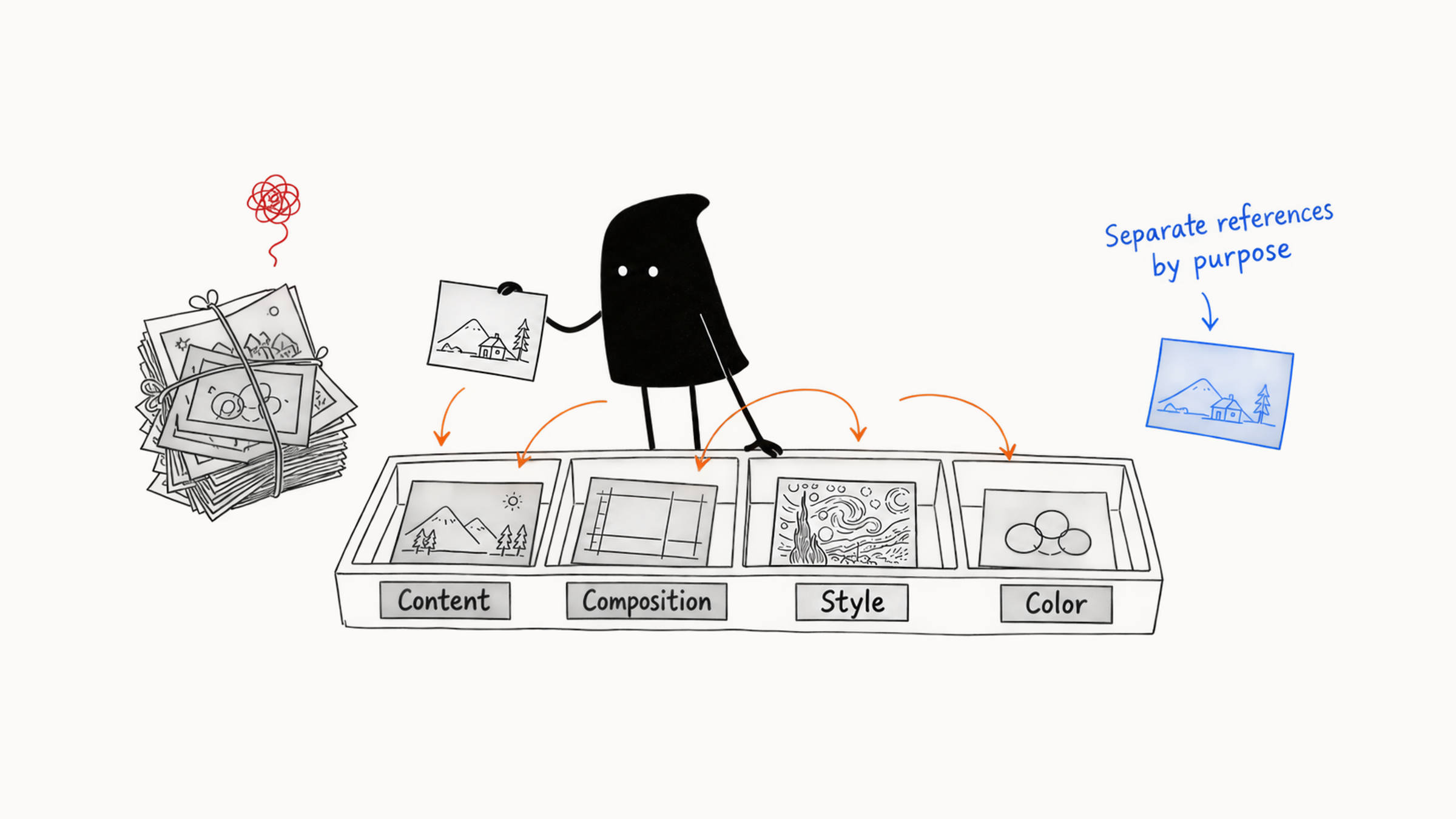
01 What text and reference images each handle
Text suits purpose, subject identity, intended action, story relationships, the change you want, and output limits. Images suit appearance, product structure, pose, position, color scheme, lighting, and material.
Say you want a poster of a person. The text can state "a fictional young architect stands before a new building, for a recruiting poster, with title space on the right." A person reference gives the face shape and hairstyle, a pose reference gives the stance, and a layout sketch puts the person on the left.
In this poster, images fill in details that text struggles to state, while text says what the images are for. The two still have to agree. If you ask for a frontal face and the pose reference shows a back view, the model has to trade off between two directions. When you check references, keep the prompt beside them.
02 Choose a reference by its control goal
Classify a reference by the problem it solves. An image may hold several kinds of information, but it works best when it carries one main goal.
| Type | Main role and limits |
|---|---|
| Content | Shows a combination of objects, such as a tent, a folding chair, and string lights. It doesn't guarantee exact structure |
| Composition | Subject position, size, shot size, viewpoint, and blank space. A sketch with clear regions works too |
| Pose | Body direction and how limbs relate to props. Choose images with a clear outline, little occlusion, and a similar angle. Complex actions still need checking |
| Style | Medium, brushwork, lighting, material, and design language. Avoid bringing along a strong subject |
| Color | Main, supporting, and accent colors, brightness, and saturation. A color swatch or mood board works |
| Person or character | Face shape, features, hairstyle, build, clothing, and signature traits. Use clear, unfiltered images with stable light, covering the target angles |
| Product | Shape, proportion, material, color, and packaging. Keep the real product image and generate only the surroundings, so labels, ports, and proportions don't change |
| Line art, sketch, and structure | Outline, layout, and spatial relationships. Edges, depth, or pose skeletons belong here too. Add style and material separately |
For example, Firefly’s composition reference uses the reference image’s outline and depth to guide the layout.
03 Write a four-part note for each reference
After you upload a reference image, write its purpose, what to keep, what may change, and what to exclude.
Purpose of the reference: what it controls
Keep: which traits carry over
Change: what adapts to the new task
Exclude: what must not come into the result
Take the person poster:
Purpose of the reference: provides only the person's face shape, short hair, and age impression. Keep: oval face, black short hair, natural brows. Change: clothing becomes a light gray suit, the expression becomes a confident smile, the setting becomes a bright studio. Exclude: the original background, jewelry, pose, and photographic filter.
Only the face shape, short hair, and age impression are used here. The original's jewelry, background, and pose may be lovely, but this time you arrange them to suit the recruiting poster. Picking out only what you need from images you like keeps the reference working for the task at hand.
04 Choose clear references, and crop before using
A strongly styled portrait contains face, pose, clothing, composition, and light all at once. If you only need appearance, crop a clear head shot first. If you need a pose, prepare a separate full-body image with a clear outline. The less irrelevant content a reference holds, the more easily the model picks up the trait you want. When you choose, check:
- The subject is clear and the resolution is sufficient.
- Occlusion is minimal and key structures are visible.
- The light and filters keep the subject's original look.
- The background elements fit the target task.
- The angle is close to the target image.
- The source and permitted use are clear.
Prepare references for whichever angles the final images need. Side faces, full-body proportions, and the back of clothing need their own views, and if you only have one frontal photo, those parts still have to be added.
The model reads whatever is visible in the reference. When you only want the face, first crop out the full body, the room, and complex props so the model mainly sees the face. Crop by purpose. For appearance, keep the head, shoulders, and skin tone in natural light. For pose, keep all four limbs and any props in contact. For a product, keep the full outline, key ports, and real material. A composition reference can be simplified to grayscale blocks or a sketch, which cuts specific content that would interfere.
When cleaning up, also remove what would mislead the model, such as watermarks, unrelated people, heavy filters, mirror reflections, and wrong text in the reference. Removing a watermark applies only to your own material that you have the right to use. For images of unknown origin, confirm the license first.
Once the reference is ready, pair it with a simple prompt and test this image alone. See what the result actually keeps. If you wanted a color reference and it mostly brought the original subject and background, swap or crop the image first. When you know what each image does, it's easier to tell where a change comes from once you combine them.
05 How multiple references divide the work
Multiple references suit complex tasks, but each added image adds a source of conflict. Before you combine them, number them and state each role.
Image A: the person's face shape and hairstyle
Image B: standing pose
Image C: layout with the person at left and blank space at right
Image D: low-saturation blue-gray and soft side light
Next, check whether the four can work together. A gives the frontal look and B gives a side-on full-body pose, so you can try combining them. If C has the person facing away from the camera, it's hard to show a frontal face at the same time. If D turns into a strong neon night, it clashes with the bright natural light the text asks for.
Get two images working together first: subject plus composition, or subject plus style. Once the result is stable and one more kind of control is truly missing, add a third. Put six or seven in at once and mixing and conflicts make troubleshooting harder. For each added reference, say what it fills in.
Once the roles are written, check whether the tool can follow them. Ordinary multi-reference input may blend A and B's appearance. In that case, split the job into steps, or switch to dedicated person or pose reference features. Even when your text explains how to use the references, check the result at the end to see whether each image did what you meant.
A mood board is a set of images that express one atmosphere. Keep the light, color, and material consistent. If light tones, black-and-gold, and high-saturation cyberpunk are mixed together, the model can't tell which to use.
06 Four kinds of conflict and how to handle them
There are four common conflicts.
Content conflict: The reference has three people, and the text asks for one. Crop the reference, or state clearly that only the target person stays.
Composition conflict: The reference is a horizontal panorama, and the task needs a vertical close-up. Swap in a layout image closer to the target, or finish the horizontal direction first and design the vertical composition anew.
Style conflict: The reference is black-and-white documentary photography, and the text asks for a high-saturation 3D cartoon. Choose one main direction, or state that you take only the spatial relations from the black-and-white layout.
Identity conflict: The person reference and the pose reference contain different faces, so the model may blend the features. State that identity comes only from image A, and image B provides only the skeleton action.
If a reference itself conflicts with the goal, fix the reference first. Replace it, crop out the irrelevant part, or delete the image that adds little, then write the role note. Once the input is clean, conflicts between references drop.
07 Adjust reference strength
First tell apart the two kinds of controls in the interface:
Reference effect: how much appearance, style, or structure shapes the result
Strength of change: how far the result may stray from the original image
Image weight, style weight, and structure strength belong to the first kind. Raise the reference effect and the result usually gets closer to the reference. Raise the strength of change and the result may change more. Tools may use opposite words or numbers, so read the tool's explanation first, confirm which way the number goes, and then compare.
To keep more of a person or layout, raising the reference effect usually helps. But you may soon find the person looks more like the reference and the old background came along too. As the influence strengthens, extra poses and flaws from the original may be kept as well. To borrow only a mood, a color scheme, or a general direction, lower strength leaves more room for text and randomness.
When you adjust, fix the prompt, model, ratio, and seed, change only reference strength, and generate low, medium, and high sets. Compare subject retention, how well the text is followed, how much extra material comes in, and room for change, then choose the level that fits the current stage. When you're looking for direction, leave room for variation. For a series or the final version, strengthen the traits you need to keep. If the subject is steady but the old background came along too, stop and compare again.
Before comparing strengths, check the reference’s job: Firefly’s style reference guide uses these images to guide the look, theme, and mood.
08 Verify content that must be exact
After generating, check by the type of reference. For a person, check the features, age, and identity. For a product, compare item by item with the real thing. For composition, check position relationships. When you need accuracy down to size and spacing, calibrate on a design grid. These need extra protection:
- Real products, packaging, and ports.
- Official logos, text, prices, and QR codes.
- A real person's identity and likeness.
- Medical, engineering, and legal structures.
- Layouts that need strict dimensions.
The reliable approach is to use original assets and layered design. AI handles the background, mood, creativity, and supporting elements, while exact content is placed in post-production or reviewed by specialists.
09 Confirm source and permitted use first
Check the license before you use anything. An image you can view and save online needs different permissions for training, adaptation, or commercial use, and each has to be confirmed separately. Before you use a reference, record the source, the author or rights holder, the scope of the license, and the project use. For material a client supplies, confirm that the client has the right to authorize it. A photo of a real person also involves consent to their likeness, and brand assets must follow trademark and visual guidelines. For license checks before commercial use, see can AI-generated images be used commercially.
For a style reference, extract visual methods you can describe, such as low saturation, thick lines, blank space, and paper grain. In published projects, borrow only the style method and don't directly imitate the highly recognizable style of a living artist, and check whether the output comes too close to a specific work, character, or brand image. Personal practice, internal proposals, and commercial publication carry different risk requirements.
10 A reference plan for three posters in one series
Suppose you're making three posters in a series for a fictional fragrance brand. The subject is the same amber glass candle jar, the composition is restrained, the color is warm, and the three images stand for morning, afternoon, and evening.
Fix the subject first. Take front and 45-degree photos of a real or your own product, and get the jar's proportions, wooden lid, and label area right. The jar appears on all three posters, so consistency begins with this reference. Next, draw a layout sketch: the product in the lower third and the title above. Use this layout for all three images. For warmth, add materials, light, and color images whose sources are clear, and take warm wood tones, linen texture, soft light, and a low-saturation palette from them. With the references ready, the roles can be written like this:
Product image: keep the jar's shape, amber glass, wooden lid, and label area
Layout image: keep the product at the bottom and blank space above
Style board: take natural materials, soft light, and low-saturation warm tones
Change: the light across the day and a few background props
Exclude: brands, text, specific products, and people from the references
Make the morning version first, and see how much of the product holds and whether the composition works. Once that's stable, fix the product reference, layout, and base prompt, and for afternoon and evening change only time, light, and a few props. Then compare all three side by side. The light should show the time of day, while the jar's proportions, position, blank space, main color, and material should look like one set. After that, add the official label, title, and brand elements in design software. For keeping a whole series consistent over time, see how to keep AI images consistent.
Save the reference images you'll use again, along with their purposes. Organize them by project, reference type, and source, and note for each image its purpose, suitable angles, exclusions, source and license, and test conclusion. A library can hold failed references too, as long as you write down why: "brought in too much background," "filter changed skin tone," or "product angle didn't fit" will save wasted effort next time.
Before generating, confirm that each reference has one main role, that references and text agree on the goal, and that no references conflict in composition, light and color, or identity. Check that what to keep, what may change, and what to exclude are written down, that the reference strength matches an exploration or convergence stage, that exact content has original material and human verification arranged, and that source, permission, and publishing scope are clear.