
DeepDojo.AIPublished 2026-11-07Updated 2026-11-10中文
How to Keep AI Characters and Products Consistent
You like one image, and then the second one looks like a different person. A few images later, the clothing or art style has slowly shifted too. This departure from the original design is called drift.
When you make a series, you have to catch it and fix it before it builds up.
A series should have variety, of course. A character can change actions, a product can change backgrounds, and a brand can change themes. But you decide which things may change and which must stay.
Test a small set first, confirm the results are stable, and then go to batch. That saves you from redoing an entire set later.
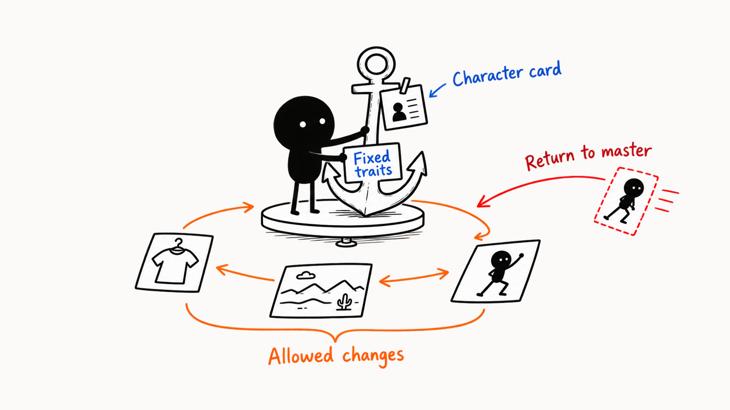
Before you start a series, decide whether you are keeping a character, a product, or a brand. A control card can list what is fixed, what may vary, and the current scene.
Build a master for the character, protect real product assets directly, and write brand feel as visual rules, because a seed alone can't hold consistency. Drift in a series builds up slowly, and by the time you notice it, a whole set often needs redoing.
So make a small sample, run a stress test, then batch-generate, check side by side against four layers, and hand the consistency plan to whoever picks it up next.
01 Decide which kind of consistency to protect
"Looks like a set" isn't specific enough. A person must be recognizable as the same person, a product must match the real item, and a brand may even change the people while the set still follows shared visual rules. Decide which kind of consistency you're protecting, and your checks won't blur together.
- Person consistency covers the face shape, features, hairstyle, skin tone, age impression, and build of the same person.
- Character consistency also covers clothing, color scheme, props, silhouette, personality, and world.
- Product consistency covers real shape, proportions, material, color, packaging, label, and ports.
- Brand consistency covers a set's color, composition, light, material, the character of its people, and post-production layout.
- Scene continuity covers the space, time, prop positions, and light changes from one image to the next.
At the start of a project, write one scope sentence. For example:
Across three picture-book illustrations, the little fox's face shape, orange fur, blue overalls, and build are fixed. Actions, expressions, and forest locations change with the story. Watercolor brushwork and a low-saturation palette run through the whole set.
That sentence states the character's identity, the scene changes, and the series style separately, so you can check image by image afterward.
02 The consistency control card: fixed, flexible, current scene
Write what stays and what may change in one place, and you have a consistency control card. Three columns do the job: fixed elements, flexible elements, and the current scene.
| Layer | Purpose | Picture-book character example |
|---|---|---|
| Fixed | Establishes identity and series recognition | Round face, big ears, orange fur, blue overalls, warm watercolor |
| Flexible | Lets the story keep developing | Expression, action, camera, weather, setting, and props |
| Current scene | States what changes in this image | Crouching beside a rock after rain to look at a snail, medium shot, soft overcast light |
First pick out the features that make you recognize this little fox. They're usually the outline, main color, clothing, or a signature prop. "The same fox" is too broad, and listing twenty details makes each image hard to check. A few clear fixed elements are easier to keep checking. Then look at how the story needs the fox to change. Expression and action can change while the basic clothing stays fixed for now. A brand image can swap seasonal props while keeping the main color and blank space. That way later images carry new content, and readers still know they belong to the set.
03 A seed can't hold consistency
Fixing a seed is the first idea that comes to mind when you make a series. With the same tool and settings, it does make small changes easier to compare and gives similar results. But a series has to change scenes and actions, and once the prompt, reference, ratio, or model changes, the look can still shift a lot under the same seed. For people, products, and brands, set up separate conditions to keep what matters. Consistency takes several conditions working together:
Fixed description + stable reference images + suitable model and settings
         + staged generation + local fixes + version records
Here is how the work divides:
- People: use a person reference and fixed traits to hold identity, and check it every round.
- Products: use real material, protected areas, and separate layers to hold structure.
- Brands: use a color palette, composition rules, style references, and post-production templates to stay uniform.
- Seeds: record the random starting point, which helps comparisons under the same conditions. What a seed actually records is explained in why the same prompt gives different AI images.
04 Build a master reference for a person
Pick one main reference as the shared basis for every later image. This is the master reference. Prefer an image with clear traits: natural light, few filters, and face shape, features, hairstyle, and age impression all visible. With identity settled, add the angles you need. For a full-body shot, add body proportions and basic clothing references. Choosing the main reference is covered in how to use reference images in AI art.
The person's control card uses the same three columns, with the master reference and needed angles attached. Fixed elements are face shape, features, hairstyle, skin tone, age impression, build, and signature accessories. Flexible elements are how clothing, expression, and action may change. The current scene is the change this image actually uses.
Once you have the master reference, test with a simple background, stable light, and a similar angle. If you can't tell it's the same person even then, it will be harder after you change scene and action. When the basic result is stable, vary the camera step by step. Jumping from a front close-up straight to an overhead long shot of many people loses identity traits easily. In the prompt, separate fixed identity from the current change:
Use the person reference to keep the oval face, black shoulder-length hair, natural brows, fair skin, and an age impression of about 25. In this image she wears a dark green trench coat and stands at a bus stop after rain, looking left; half-length medium shot, soft overcast light. Identity and hairstyle stay fixed, and clothing, scene, and action change as described here.
When you select, first confirm it's the same person, then look at action and picture. If the face has drifted, go back to the master reference and correct it, and keep using the confirmed identity reference for the next image.
A picture-book character may have very simple features, while the outline, clothing, and colors are what people remember. In the character card, write the age or species, head-to-body ratio, appearance, main clothing color, props, and personality, plus art style, line, and material. When you design a character, you always want to add one more intricate detail, but it can turn into a burden to check on every page. To start, make the outline clear and settle on a few main colors and a signature prop. Once the character is recognizable, test different angles, expressions, and actions. Children's content also needs a check for age-appropriateness: the character's proportions, expressions, light, and clothing should suit the target age group.
05 Protect real product material
On a product image, a changed button, a lid proportion that's slightly off, or a package color that's slightly wrong can make people misidentify the item. A product image has to match the real structure and label. When you already have real product photos, keep them first and move the parts you want to explore into the setting. The flow centers on the real product:
Shoot the real product from the angles needed → choose an angle, cut out or protect the product
→ generate the setting → composite the real product, add contact shadow, reflection, and ambient light
→ add the official label, logo, and text → check item by item against the real thing
A product control card records the outline, size proportions, material, color, ports, label position, transparent or reflective traits, and structures that must not change. Scenes, props, seasons, and light are flexible. If you must have the model repaint the product, use the real image as a strong reference and limit the edit area. Then compare the result side by side with the original.
06 Write "brand feel" as visual rules
When brand images sit together, they should look like they come from the same brand. Write "brand feel" as specific color, composition, and material rules so that generation has something to follow. A simple brand visual card can include:
| Item | Example rule |
|---|---|
| Main color | Cream white and light apricot, gray-green as support, a little dark brown as accent |
| Composition | Single subject, blank space on the right, subject about a third of the frame |
| Light | Soft window side light, light shadows |
| Material | Light wood, linen, frosted glass |
| People's character | Natural, quiet, real actions |
| Background complexity | Low detail, at most two supporting props per image |
| Post-production layout | The same type hierarchy, title position, and logo safe zone |
| Excluded directions | Strong neon, high saturation, stacked elements |
When a brand color has to be exact, generate only close to the color direction and calibrate to the official value in post-production. Use the brand's own files directly for fonts, logos, prices, and official copy. Save good examples that follow the rules and counterexamples that break them, to help the team judge new topics at the edges.
To carry an approved look forward, Firefly’s style reference feature lets you upload an existing image to guide the next image’s visual style.
07 Small batch first, then stress-test, then production
When you start a series, first fix the model version, base prompt, main reference, style reference, ratio, main settings, and post-production template. Each image reuses those conditions and changes only the scene information it needs. Make a small set first, say three, compare them side by side, and then extend to ten. Solving problems at the small stage is far easier than rechecking after a batch.
Once a front half-length image is stable, try harder ones such as a side face, full body, or several people. This is called a stress test, and it confirms where the current method still keeps the traits. Test with the scenes you'll draw next, adding one difficulty at a time. A person goes from front to a slight side view, and once that holds, to full body. A product keeps its angle while the background changes, then keeps the background while the angle changes. Wherever drift starts, check that step first.
| Range of change | Common cases | Production plan |
|---|---|---|
| Small | New background, slight expression, a few props | Batch within the range already verified |
| Larger | New clothes, bigger action, clear camera change | Test a small set first |
| High risk | Extreme angles, multi-person interaction, cross-medium style, regenerating the product | Verify the workflow separately, and layer or retouch by hand where needed |
For long-term use as a reference, choose the version that holds up at the angles and actions you need. A beautiful frontal image that's unrecognizable once the face turns can stay as a single finished image. The master reference should give the whole set an identity to rely on, so clarity and stability matter more.
For a recurring layout, Firefly’s composition reference guide explains how to upload a reference, match its outline and depth, and adjust the strength.
08 Compare side by side and check in four layers
Looking at images one by one, each may seem fine. Shrink them to one size and line them up in order, and the jumps in face shape, jar size, or light and color become obvious. Look at the whole set this way first, then check identity, product structure, layout, and scene continuity in turn. "Looks like the same character" is easily swayed by personal feeling, and breaking it into observable layers makes team review more consistent.
| Layer | What to check | Direction for the fix |
|---|---|---|
| Identity | Face shape, features, age, build, signature outline | Go back to the person or character reference |
| Setup | Hairstyle, clothing, color scheme, props, product structure | Local repaint, replace with real material, or reuse the master reference |
| Series language | Composition, light, color, line, material, background complexity | Fix the style reference, layout, and post-production presets |
| Scene continuity | Time, weather, spatial direction, prop positions, preceding and following action | Fix against the images before and after. Picture books, storyboards, and serial ads especially need this |
When a face or product structure is wrong, go back to the person reference or real material to fix it. A color grade can make the whole set look coordinated, even more pleasing, but the error is still there. Pass identity and exact structure first, and then harmonize style and scene. Write each problem as "layer, fact, action." For example: "Setup layer: in page three the backpack turned from blue to green. Repaint the backpack, cite the character color sheet, and keep the pose and background." A note like that can go straight into the next round.
Common failures and what to do next:
| Failure | Next step |
|---|---|
| Reference is blurry, occluded, heavily filtered, or lacks angles | Pick a clearer main reference and add needed angles |
| The core description changes in every image | Fix age, hairstyle, temperament, and similar descriptions, and replace only the scene information |
| Too many conditions changed at once | Test action, scene, camera, and style separately |
| Several people's traits mix | Give each person a separate reference and position note, and generate separately then composite or edit one at a time where needed |
| Identity lost across styles | Keep the character sheet and build a separate master reference for each style, such as realistic, watercolor, or 3D |
| Product was redesigned | Use a real product layer and let AI handle the setting and contact areas |
| The series drifts further with each image | Return each image to the same master reference and control card. Only a reviewed new master can replace the base material |
09 Produce a set of picture-book character images
Say you're making a three-page picture book about "Mimi the little fox": Mimi puts on shoes at home, walks into the forest, and crouches to look at a mushroom. Start with a character card: an orange little fox, round face, big ears, blue overalls, white undershirt, small build, curious and gentle personality; warm watercolor, soft lines, low-stimulation color. Fix the character's look and art style, and let the action and scene change page by page.
Next, generate front, side, and full-body master images against a simple background and choose the set with the clearest outline. Test three basic actions to confirm that the proportions of hands and feet, overalls, and ears hold across poses. Each page's prompt adds only scene information. Page three, for example:
Use the character master to keep Mimi's round face, big ears, orange fur, blue overalls, and small build. Mimi crouches on a forest path watching three red mushrooms, her expression curious; medium shot, soft overcast light, warm watercolor picture-book style. Character look and basic clothing are fixed, the background is simple, and the upper right is kept for text.
After generating the three pages, compare character, clothing, color, line, and text area side by side. For small drift in a face or outfit, repaint locally. If a whole page's style has shifted, return to the master and base style and regenerate. Finally, unify color and page layout.
10 Hand off a consistency plan
A consistency plan should let another creator carry on. A hand-off package includes at least the current control card, the valid master, reference image numbers, base prompt, main settings, positive and negative examples, and post-production templates, plus the working order that has been proven: which master to use, which fields to change, and how to choose images and correct drift. For a product, add real material and structure check images. For a brand, add official color values, fonts, the logo, and layout files. For a character, add the necessary angles and the clothing in the current plot. Open sensitive portraits and client material only to people with access.
To test whether the handoff is clear enough, ask someone who didn't take part in the early work to try making one image. Wherever they keep asking questions, make that rule clearer, and if an image shows drift, find the cause and add a note. However neatly a control card is written, you only learn whether it works when someone else carries on with it.