
DeepDojo.AIPublished 2026-11-07Updated 2026-11-10中文
How to Fix AI Image Hands, Text, and Warped Products
Sometimes you look at an image and feel it's wrong, but you can't yet say what to fix. That feeling is a fine starting point. The next step is to say clearly what is wrong where, and what you want it to become.
What you can do after troubleshooting matters more than finding the cause: change the prompt, swap the reference, adjust settings, fix the mask, move to post-production, or regenerate. If troubleshooting leads you to the least effort and the most reliable next step, while keeping what is already right, it has done its job.
After you see something wrong, state it as "the observed fact plus the target state," then work through four layers: content, visual, technical, and delivery. Wrong hands, garbled text, and a deformed product each have their usual causes, and a drop in sharpness means finding which step caused it.
Once you have a cause, compare repair costs: change the prompt, swap the reference, adjust settings, fix the mask, move to post-production, or regenerate. Choose the cheapest option that keeps what is already right, and decide ahead of time when to switch methods.
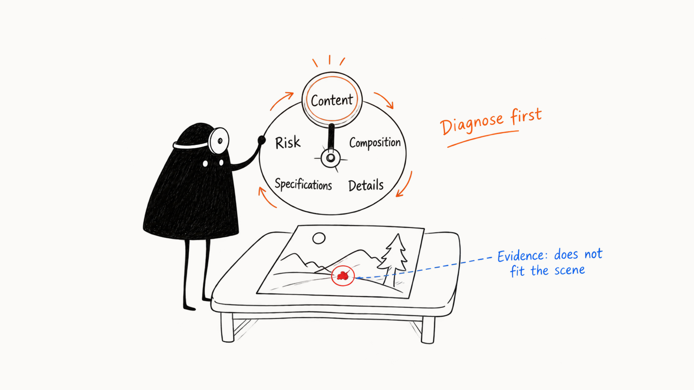
01 First separate symptoms from causes
"The person doesn't stand out," "the cup looks like it's floating," "the title doesn't fit," and "the character became someone else" all describe what you see, which is the symptom. The cause isn't settled yet. Take the person who doesn't stand out. The subject being too small is one possibility, and the background being too bright, the depth of field too deep, or the title drawing the eye could also explain it. Go back to the image for evidence, then use comparison to judge the cause. When you troubleshoot, first write two sentences:
Observed fact: the subject takes up about a tenth of the frame, and the background sign is brighter.
Target state: the subject takes about a third of the frame and is the highest-contrast area.
After those two sentences, the next step is a bit more concrete: try enlarging the subject or lowering the background brightness, and check composition and contrast first. The vague "doesn't stand out" has become something you can compare. To tell which cause matters more, test them separately:
- Keep the subject size and lower only the sign brightness, then look at a phone thumbnail.
- If the subject is clearer, background contrast was affecting the focus. If you still can't see it, test the subject size on its own.
- Write down each effect. Changing several things at once can make the image more usable, while comparing them separately shows the specific cause.
02 Four layers of image problems
| Layer | Focus of the check | Common problems |
|---|---|---|
| Content | People, objects, counts, actions, relationships, and facts | Wrong number of people, left and right swapped, odd fingers, changed product parts, garbled text, identity drift |
| Visual | Subject, composition, camera, light and color, material, and style | Subject too small, title area short, crowded, conflicting light sources, background stealing focus |
| Technical | Size, sharpness, noise, edges, masks, seams, color mode, and format | Defects after enlarging, repainting, compression, or export |
| Delivery | Actual use, platform specs, text, accuracy of product and brand, permission and safety, file completeness | The image is beautiful but can't be used or published |
Order your checks by how much the task depends on each thing. Confirm the real product, a person's identity, the platform ratio, and the title space first, then compare taste in light and shadow, and refine texture last.
Direction problems affect the subject, purpose, composition, or overall style, and they usually call for regenerating, switching candidates, or going back to the Brief. Local problems sit in hands, edges, clutter, text, and small areas of material, and suit inpainting or post-production. Before you fix a hand, step back and look at the whole image. Is the subject right, does the composition fit the placement, and are the light, color, and style close to the goal? If these basically hold, a hand is worth the time. If the overall direction is still open, even a repaired hand and texture may be redone later. There's one more case. Each problem looks small, but together they involve several people, products, and text. Fixing piece by piece interferes with itself, so put switching candidates and layered compositing into the comparison too, and it may take less effort.
03 People, multi-person relationships, and hands
First decide whether the hand carries key information. A person in the far background can be simplified, while a hand holding a product in an ad must be accurate. When you fix a hand, check the palm direction, finger count, joints, wrist, and how the hand touches the object. Make the mask cover the whole hand, including the wrist and contact edge (for how to draw the mask, see five ways to edit an AI image), and then prepare a pose reference. If the hand also holds a product, protect the real product first and layer the hand and product separately where needed.
When you fix a face, first tell which kind of "not like" it is. If the facial structure is odd, circle the face and repaint it while keeping the hairstyle, angle, and light. If the features are normal but it looks like a different person, go back to the main reference, fixed description, and generation conditions to see why the identity changed. Keep using the confirmed face in later images, and the deviation stops with this one.
Multi-person images easily show blended faces, odd limb connections, wrong counts, and confused lines of sight. Reduce the number of people or split them into groups first, and state each person's position, action, and clothing. When identity matters, generate each person separately, then composite them on the canvas and unify the light and shadow.
If the selection edge is too hard, Adobe’s Generative Fill guide explains how brush size and hardness adjust its coverage and edge softness.
04 Text, logos, and counts
Image models can generate text-like shapes, but exact text still has to be verified character by character. Chinese titles, prices, dates, ingredients, notices, QR codes, and legal text belong in design software. For a poster, make a text-free base image first and state the title area and the background complexity. If garbled text appears in the image, clear it locally and then place the official text. For the real logo, use the vector or high-resolution file the brand provides, and keep its proportions, safe area, and color.
The more exact the count, the more relationships the model has to handle. "Seven apples, five people, each holding a different item" is easy to draw too many, too few, or mixed up. First decide whether it must all be done at once. If it has to be exact, generate in groups, use real material, or place items one by one on the canvas. Left and right, front and back, handing over, and pointing also suit step-by-step work. Fix the people's positions and composition first, then add the action, and give a sketch or pose reference where needed. After generating, count and check relationships object by object.
05 Check the product structure first
A real product's outline, proportions, color, ports, label, and material shape what users believe, so any change to structure gets handled first. Compare the generated image with the original product image side by side. First check the outline proportions, and structures like the cap and buttons, then package color, material, and label text. Then see whether size is right when the product sits with hands and props, and whether position and light line up.
If the comparison shows the whole product was redrawn, rethink your approach. Fixing the buttons, cap, and label one at a time rarely restores the original structure. Go back to the real product photo, cut out the subject for layered compositing, and let AI handle the background and contact light, which gives you more reliable factual grounding. Keep concept products and real goods clearly separate. A concept image can explore shapes, but when displayed publicly it should say what it is. For e-commerce and ads that use real goods, the image content must match what is actually delivered.
06 Fix subject, composition, light, color, and style
When the subject is unclear, check size, position, sharpness, and contrast first. Enlarging the subject, cutting background elements, lowering background brightness, or using a shallow depth of field is more specific than adding more "make the subject stand out." When the composition doesn't suit the purpose, lay the real title box, logo area, and button area over the image to test. When space is short, extend the image, move the subject, or change candidates. When the subject is cropped or the person's direction conflicts with the blank space, recomposing is usually better than cropping hard. If the details are messy, delete irrelevant objects, then lower background contrast and sharpness. Confirm the large structure first, then fix texture, edges, and small props, which cuts rework.
| Problem | How to check and fix |
|---|---|
| Conflicting shadows, a subject that looks pasted on, material without volume | Find the main light, check subject, background, shadow, and reflection against it, and redo contact shadow and ambient light if needed |
| Too many main colors, warm and cool mixed up, brand color off, unclear priorities | Cut the main colors, unify saturation and brightness, and calibrate brand and product colors to official values |
| Mixed media, jumps in line grain or rendering level | Check the prompt, reference consistency, and style strength, keep one main medium, then unify light, color, and material |
Light, color, and style affect each other, so change one first in each round. Decide the main form of expression, such as photography or illustration, then adjust light and color, and you usually save rework.
07 When sharpness drops, find which step did it
When an image turns blurry, flip back through the previous versions. An image that was blurry from the start and one that went blurry after upload are different steps with different fixes. Find where sharpness started to drop:
| Step where it appears | Check first |
|---|---|
| Blurry from the original generation | Initial size, subject proportion, model, and quality setting |
| Blurry after repeated repainting | Go back to a clear version, and check the edit range and the effect of repeated editing |
| Fake texture after enlarging | Lower the enhancement or change the upscaling method |
| Blurry after upload | Platform compression and export specs |
When you see white fringes, stray color, lost hair strands, or damaged transparent material, go back to the mask and the subject layer to fix them. Sharpening mainly makes edges more obvious and can also amplify noise, and the edges of transparent material need separate handling. After outpainting, seams may show repeated texture, broken straight lines, sudden color change, or perspective that doesn't connect. Shrink the image to see the overall structure first, then zoom in and work on the seams. If the problem is large, go back and extend in sections. If only a small area has repeated texture, clean it with local inpainting or traditional retouching. Before export, confirm ratio, pixels, color space, transparency needs, format, and file size, and output separately for web, social, or print. Keep the unenlarged base image, layered source files, and key versions, so you can go back.
Firefly’s editing options list Upscale separately from Fill and Remove; when checking sharpness, record which operation you actually used.
08 Trace the cause through the input chain
Check along four input stages:
- Prompt: whether the subject, priorities, and spatial relations are clear, and whether requests are too many or conflicting.
- Reference images: whether role, sharpness, crop, and strength suit the task, and whether several references conflict.
- Settings: whether ratio, randomness, reference strength, strength of change, and style control suit the current stage (what each setting does is covered in seven kinds of AI image settings and when to adjust).
- Editing method: whether the method matches the problem scope, whether the mask seam and protected area are clear, and whether layering is needed.
Troubleshoot from low cost to high, change only one main condition at a time, and save the before and after images:
Check text and input images first → then settings and edit range → last consider switching models or workflow09 Compare repair costs, and set when to switch methods
One problem may have several fixes. Look at four things together: how likely the fix is to work, which finished parts it touches, how long it takes, and whether you can deliver with confidence afterward.
| Problem | Low-cost action | Escalated action |
|---|---|---|
| One stray object in the background | Local removal | Replace the background |
| Title area too short | Extend one side | Recompose |
| A person's face slightly deformed | Local repaint | Return to the person master and regenerate |
| Whole product deformed | Replace with the real product layer | Rebuild the layered scene |
| Series color drift | Unify the color grade in post | Rebuild color references and regenerate |
| Multi-person relationships badly confused | Generate in groups or separately | Redo composition and compositing |
Choose the fix, and also decide when to change methods. Try the smallest range first. For example, if two rounds of local repainting both turned the person into someone else, go back to the master. If outpainting twice still doesn't connect the perspective, switch candidates. After repeated failures, it's easy to think "one more try will work." Setting the condition in advance makes it easier to stop when the time comes.
Exact text, logos, data charts, QR codes, and fixed layouts go to design software. Real products, architecture, engineering, medical, and legal images need specialists to check. High-demand portraits need confirmation of likeness and identity and may call for traditional retouching. If fixing makes errors multiply, makes quality worse, or changes the real structure, switch to a more controllable tool. Print and commercial delivery that need pixel precision, vector graphics, or fixed layouts also go to the matching software. Whether to keep using AI depends on whether it can lower total cost while staying accurate.
10 Case: diagnosing a hand cream ad
Suppose a hand cream ad has three problems: the model's right hand has six fingers, the tube is partly blocked, and the title area on the right is too cluttered. The client has already confirmed the person's face, clothing, and overall light.
It looks like three problems, and the order of handling depends on whether they're linked. The finger error is content, the blocked product affects delivery, and the right-hand background is a visual and layout issue. Keep what the client confirmed: the face, clothing, and overall light. The hand and the tube are touching, so fixing one can affect the other. Check that relationship together first, and clear the title area afterward. Prepare a real product reference, make the mask cover the whole palm, wrist, and contact area, and the local prompt can read:
Change only the right hand and the area where it touches the hand cream. Generate a naturally structured right hand with five clear fingers, lightly holding the real tube. The product faces the camera, with shape, color, and label area matching the product image. Keep the person's face, hairstyle, clothing, pose, background, and light.
After generating, check the fingers, the grip, the product proportions, and the light. Once it passes, lock that part, then circle the clutter on the right and fill in the title area with a continuous light gray wall and a soft gradient. If two rounds of fixing the hand both damage the product, keep the real product and the person separately, and rework the contact relationship in layers. Once both are handled, go into design software to add the official product text and title. Finally, check product accuracy, the person's consent, platform size, and file versions together before delivering for the current use.
11 Preview in the real environment, and record how to prevent it next time
Shrink the image to its actual viewing size, put it into the final layout, and look again.
| Where it is used | What to look at |
|---|---|
| Phone | Whether subject outline, title area, and contrast are clear |
| Web banner | What a narrow screen crops, and whether key information stays |
| Resolution, shadows, thin lines, and actual size | |
| Profile page, product detail page | Whether the set is harmonious and the images don't overpower the main one |
An image can look beautiful when enlarged and still show no clear subject on a phone, which means it needs more adjusting. Judge whether it passes at the place where it will finally appear. After previewing, record the specific differences, such as "subject outline vanishes on phone," "narrow web screen crops the right-hand product," or "print proof lacks shadow detail." Focus your edits on the composition, contrast, or export settings behind those differences.
After you fix an image, record "problem, cause, action, prevention." For example:
Problem: the horizontal cover has no title space on the right
Cause: round one used a square ratio, and the title box wasn't overlaid when choosing
Action: extend to the right and clean up the background
Prevention: explore at the target ratio, and overlay the real layout on the comparison board
When you record failure causes, watch closely for explanations that sound very reasonable. If the same problem recurs and a comparison confirms the cause, you can write it into a template and check it ahead of time. Mark unconfirmed ones "to be tested." Decide whether to use them once results are in, so one guess doesn't become a rule you follow every time afterward.