
DeepDojo.AIPublished 2026-11-07Updated 2026-11-10中文
How to Turn "Premium" into Composition and Light
Picture someone standing in a train station. Move the camera in close and you notice the expression. Pull back, and how empty the station is, and how the person relates to the space, start to matter more.
The subject is the same, but the feeling of looking at it has changed.
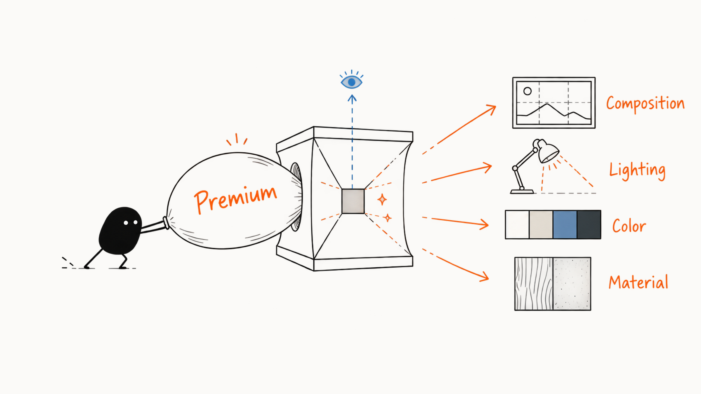
Camera, composition, light, color, and material choices together make up visual language. Turning "gentle" into distance, gesture, and light does more for a prompt than a string of pleasant adjectives. You can keep studying art theory later.
For now, make a few well-grounded choices.
Instead of piling adjectives into the prompt, turn the feeling into a few concrete choices:
- who the image should emphasize and how large the subject is
- which composition, close or far
- where the light comes from and whether it's soft or hard
- how color and material share the work
"Premium," "gentle," and "lonely" can each become a set of checkable decisions like this. Then hold the subject fixed and change one visual variable at a time to see what each choice actually did, and the trade-offs in an image have a reason behind them.
01 Decide how to view the image from its purpose
Visual language serves the purpose first. An avatar shows a face, a product image presents the product accurately, a story illustration places the character in a setting, and a poster also has to leave room for title and information. Before you describe anything, answer three questions:
- What does the viewer need to see first?
- What relationship does the viewer also need to understand?
- Where will the image end up?
The answers tell you where to put the focus, what story to tell, and how to set ratio, composition, and blank space. Take "a person walking in the mountains." For a clothing ad, use a medium shot, side light, and a simple mountain backdrop so the clothes are easy to see. For a travel image, pull the camera back and shrink the person so the valley feels vast.
02 How to make the subject stand out
When you can't find the subject in an image, see where your eye lands first. Maybe the person is too small, the background is brighter than the person, or everything is equally sharp. Size, position, sharpness, and contrast together decide where the first glance falls.
| Condition | How it guides the eye |
|---|---|
| Size | A larger subject is easy to recognize, and a smaller person shows the scale of the setting |
| Position | Centered is more direct, while off to one side leaves room for text, a line of sight, or a direction of motion |
| Sharpness | A sharp subject on a blurred background focuses attention, while sharp front and back stress the environment |
| Contrast | Differences in light and dark, warm and cool, color, or complexity all make the subject stand out |
You can write these relations straight into the prompt:
A single white coffee cup fills about a third of the frame at lower right, with a low-detail warm gray tabletop behind it, crisp side light on the rim and edges, and clean blank space on the left.
This description says how big the cup is, where it sits, how much detail the background has, and where the light falls. That tells you what to look at in the result and what to change next time.
03 Five common compositions
Composition decides how subject and space are organized. Five common ones are enough to start.
| Composition | Spatial relationship and use |
|---|---|
| Center | Subject in the middle, simple background, good for avatars, single products, or covers that must be recognized fast |
| Rule of thirds | Subject at a third position, with the other side left for setting or text. Suits character stories, covers, and banners |
| Symmetry | Left-right or top-bottom echo, creating order and formality. A little asymmetry keeps it natural |
| Negative space | Low detail around the subject, for a title or a feeling of calm or loneliness. State position, area, and purpose, such as the right 40% for a two-line title |
| Foreground, middle ground, background | The subject in the middle ground, the foreground guiding the eye, and the background giving context. Every layer has a job, with no decorative clutter |
A simple composition can work very well. One centered product reads clearly, while a complex layout can scatter the eye. For several people interacting, plan positions and lines of sight. To show a large space, use foreground, middle ground, and background. After choosing, place it in the real frame and see if people and objects fit and the focus is clear.
04 Shot size, viewpoint, and depth of field
Shot size is how far the camera seems to be from the subject.
| Shot size | What you can see | What it suits |
|---|---|---|
| Close-up | A face, hand, or product detail, little setting | Expression, material, detail, closeness, and strong focus |
| Close or half-length medium shot | Expression and part of the action | Avatars, interview-style images, course covers, everyday life |
| Full-body, medium-long shot | Pose and the relationship between person and scene | Clothing, travel, stories, character design |
| Long shot | The wide setting, with the person small | The scale of a city or valley, loneliness, or grand stories |
Viewpoint is where you look from. Eye level feels natural and equal. A slight upward angle makes the subject seem stronger and taller. A downward view shows tabletops, food, and positions well. A bird's-eye view shows large terrain or a city. Depth of field is how much of the image is sharp. Shallow depth keeps the subject sharp and the background blurred, which suits portraits and products. Deep depth keeps front and back sharp, which suits architecture, interiors, and stories about people in a setting. Combine the three and the camera becomes clearer:
Half-length medium shot, eye-level view, shallow depth of field, the person's eyes sharp, the bookshelves behind softly blurred.
Wide long shot, slightly from above, deep depth of field, one small figure walking along a ridge, the valley behind in clear layers.
When you choose a shot, think first about what the viewer should see. If a product label must be legible, move closer so everything you need to show stays sharp. To convey a person's smallness in a valley, put the person far away and let the size of the space do the contrast. Choosing shot size and depth by purpose gives you more to stand on than memorizing names.
05 Light: source, direction, and softness
Light changes volume, material, and mood. State the source, direction, and softness, and your description gets much more specific.
Source says where the light comes from, such as a window, the sun, studio lamps, street lights, a screen, or neon.
Direction says how the light hits the subject. Front light makes information clear, side light adds volume, backlight makes outlines and atmosphere, and top light casts stronger shadows.
Softness shows in the shadow edge. Soft light has gently graded edges and suits gentle portraits, skincare, and daily life. Hard light has sharp, high-contrast edges and suits sunny streets, dramatic scenes, and bold looks.
"Soft early-morning window side light" gives the time, source, direction, and shadow transition. "Cinematic lighting" leaves all of that to the model. Write it out instead: "a single warm side light on the person, the background kept cool and dark, with a faint rim light on the edges."
After generating, check whether the light fits the scene. Which side of the window does it come from? Do the shadows of the person and the table fall the same way? Can you find a source for the highlights on the product? When they don't match, the material starts to look fake.
Describing light through visible conditions follows Adobe’s prompting guidance, which uses lighting, color, and scene details to make a prompt more descriptive.
06 Build unity with color and material
When you arrange color, look at warm or cool, saturation, brightness, and how many colors you use. Saturation is how vivid a color is, and brightness is how light it is. Warm colors often bring closeness, energy, and daily life. Cool colors often bring calm, reason, distance, or technology. These feelings depend on subject and culture, so always apply them to the subject and purpose.
Vivid, high-saturation colors catch attention and are common in children's content, event images, or strong emotion. Low-saturation colors are softer and suit daily life, professional content, or a quiet mood. Even with dark colors, the subject still has to be readable.
As a start, use two main colors plus one accent. For example, off-white and light wood make up the main setting while a little green adds life. Deep blue and charcoal set a technology backdrop, with a little orange light on the person. In a prompt:
The main colors are deep blue and charcoal, with the person's face and hands lit by a little warm orange light, overall low saturation and high light-dark contrast.
Blue and orange do different jobs here. Deep blue and charcoal take the large setting, and a little orange light makes the face and hands stand out. If you keep only "blue-orange palette," the model may spread both colors everywhere. After choosing colors, think about how much of each goes where. When a brand has official color values, generate a close palette first and then adjust to the values in design software. Check product colors against real photos too.
Describe material as visible surfaces, such as frosted glass, brushed metal, rough paper, matte ceramic, or soft felt. A specific material affects reflection, texture, and edges, and works better than "great texture." For style, say which form of expression you mean first, such as photography, flat illustration, picture book, or 3D rendering, then add specific traits. To mix styles, rank them first, for example "architectural photography as the main style, with a light watercolor paper texture."
07 Turn "premium," "gentle," and "lonely" into pictures
| Feeling | Visual conditions to combine |
|---|---|
| Premium | Restrained color, clear material, clear priorities, generous blank space, and clean edges, chosen by industry and purpose |
| Gentle | Natural gestures, close or medium shots, soft side light, off-white and low-saturation colors, rounded shapes, and relaxed blank space |
| Lonely | A small figure, a long shot, a large space, a single light source, cool color or low brightness, expressed through scale and distance |
| Tech | Clean geometry, a dark space, cool edge light, precise materials, and glowing elements with a clear hierarchy. Interface text and data are added in post |
You can try the combinations in the table, but the purpose decides which one to use. The same "premium" may call for a different palette and material in another industry. Whether you choose dark hard light or pale soft light, you should be able to say why. Then look at whether subject, space, and light and color work together across the whole image, and decide what needs adjusting.
08 Fix the subject and change one visual variable
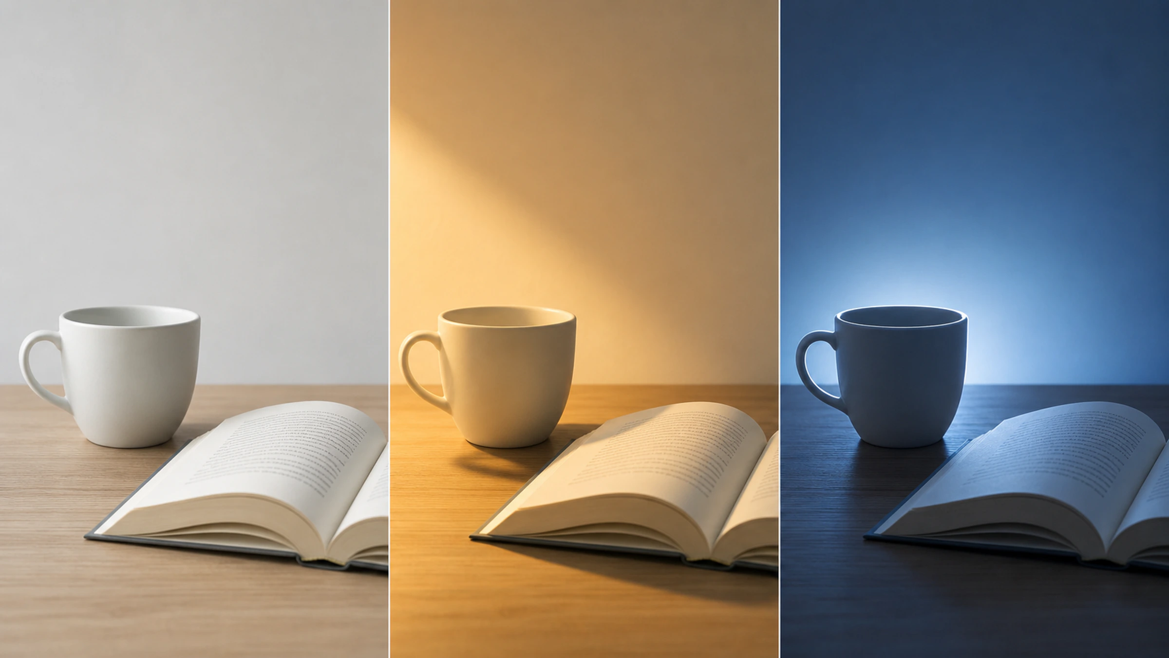
The fastest way to understand visual language is to fix the subject and scene and change one visual variable. First look at the lighting illustration below. The cup, books, and camera stay roughly the same, and the three panels use neutral front light, warm side light, and cool backlight, showing how direction, shadow, and color temperature change together.
Now a raincoat example. Suppose the base image is "a child in a yellow raincoat standing on a street after rain." The first group changes only the shot size. Version A: close-up, centered, the child filling half the frame, face and yellow raincoat clear, the street background recognizable. Version B: long shot, centered, the child taking up a tiny area, with an empty street stretching away on both sides.
A puts the attention on the expression and clothing and suits a character story or clothing image. B shows an empty street and a very small child, which more easily suggests calm, waiting, or loneliness. Changing only the shot size gives the same scene a different meaning. Compare light and color too, changing one kind of condition per group:
| Variable | Version A | Version B | What to compare |
|---|---|---|---|
| Light | Overcast diffuse light, faint shadows, soft ground reflections | Low sunset side-backlight after rain, golden outlines, long shadows | Daily calm vs a story turning point |
| Color | A low-saturation blue-gray street, with the yellow raincoat the only highly saturated color | A warm orange and light brown street, the raincoat blending into warm tones, blue water reflections as accents | A makes the child stand out through color contrast. B is more unified and warm, and the subject stands out by size and sharpness |
When you compare, keep the model, seed, ratio, and the rest of the description unchanged, so you can tell where an effect comes from. After each group, write down what you actually saw, such as "the long shot makes the setting matter more." Next time you choose a shot, you can use that observation.
09 Learn visual language from reference images
When you see an image you like, look at how it arranges subject, space, light, and color, then pick what suits your task. Look at six things:
- Subject: what you see first, and how much area it takes.
- Space: where the subject sits and how foreground, middle ground, and background are laid out.
- Camera: shot size, viewpoint, and the sharp range.
- Light: where the main light comes from and how soft or hard the shadows are.
- Color: the main, supporting, and accent colors.
- Material and style: which surfaces and medium traits stand out most.
What's worth learning from such an image is how it makes the eye rest on the subject. Relations like "single subject, large blank space, soft light, a few colors" can carry over to your own content. Before you publish, confirm the source and license, and borrow only the method. Use your own composition, characters, and brand assets. For how to pick and use reference images, see how to use reference images in AI image generation.
To borrow placement and spatial relationships, see Firefly’s composition-matching guide, which uses the reference image’s outline and depth as guidance.
10 Turn a request into an image: a night-study header
The original request is: "Make an atmospheric night-study image for an article header." Settle the purpose first: a horizontal article header with the title on the right. The subject is a young person studying at home. The viewer should see concentration first, and the setting conveys night and quiet. Translate the request into arrangements one by one:
Horizontal header, title on right → person on the left, blank wall on the right
Show the focused state            → medium shot, eye level
Convey a quiet night              → warm desk lamp, cool night view outside the window
Let the person be seen first      → simple background, clear subject
For color, use deep blue, warm orange, and a little wood tone, so indoor and outdoor light work together. The combined prompt (for the overall approach to writing one, see how to write AI image prompts):
Horizontal article header, a young person sits at a wooden desk on the left reading intently, half-length medium shot, eye-level view. A warm desk lamp lights the face, book pages, and hands, with a deep blue night view and faint city lights outside the window. The image is mainly deep blue and warm orange, the background quiet and low in detail, the right 40% a clean wall for the title later. Realistic lifestyle photography, shallow depth of field, no readable text or logo.
A deep blue night with a warm lamp is very appealing. But for an article about studying, the viewer first has to see the person concentrating, and the title has to fit. If the image feels too heavy, brighten the setting or widen the warm light. If the title area is cluttered, remove props and lower the background contrast.
11 Adapt one look to different aspect ratios
When the same image needs a square, a vertical, and a horizontal version, people often try cropping first. But once the title or the person gets cut off, the problem shows: the canvas shape changed, so the spatial relations have to change too. Square is compact, vertical reads top to bottom, and horizontal reads left to right, so each version needs its own arrangement of subject and text.
List the fixed information first: the subject's identity, main color, light, and visual style. Then write composition separately for each ratio:
- Square: subject centered, about half the frame, with a low-detail background.
- Vertical: subject in the lower half, with title space above.
- Horizontal: subject at the left third, with horizontal text space on the right.
After you generate or extend each version, compare subject, main color, and focus side by side, then preview in the real placement. When space runs short, cut decoration first and keep the subject, title area, and brand traits.
12 Check results by visual hierarchy
When you screen images, check from large to small:
- Purpose: whether ratio, blank space, and subject suit the placement.
- Subject: whether it can be found at first glance, and whether its size and position are right.
- Composition: whether the space is balanced and the relations between people and objects are clear.
- Camera: whether shot size and viewpoint convey the intended distance.
- Light: whether source, direction, and shadows are coherent.
- Color: whether the main colors are unified and the accent carries the emphasis.
- Material: whether product, clothing, and setting surfaces look believable.
- Details: whether hands, edges, text, and small objects need fixing.
When you review, beautiful textures make images hard to let go. If the subject and composition don't yet fit the purpose, choose a new direction first. Once the large structure works, put your effort into edges and small details. Keep to this order and you save a lot of wasted retouching.